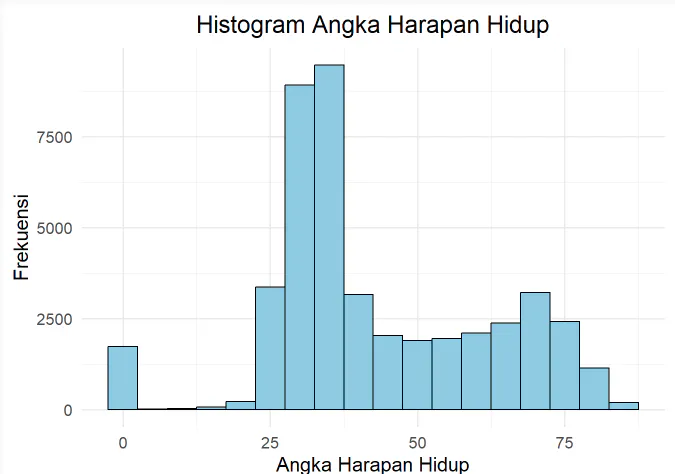
UAS Pengantar RPL
  • Bio
  • Papers
  • Activity
  • Experience
  • Projects
  • Projects
    • Regression Models
    • Data Visualization
    • RawBeans by Figma
    • Visualisasi Data dengan GGPLOT
    • Bliss.com
    • ExploreGo
  • Projects
  • Experience
  • Blog
    • ๐Ÿ… Participating in the 2025 Outstanding Student Selection (Pilmapres)
    • ๐Ÿงฉ Technical Workshop on Kosabangsa Proposal Writing and Impactful Student Program
    • ๐Ÿ“ˆ Data Visualitation
    • ๐Ÿ“Š Membuat Visualisasi Data dengan ggplot2
  • Publications
    • Budidaya Lele Dalam Ember dan Upaya Pemasaran Digital Menggunakan Media Sosial
    • Optimalisasi Media Sosial Youtube sebagai Media Berwirausaha
  • Recent & Upcoming Talks
    • Example Talk
  • Teaching
    • Learn JavaScript
    • Learn Python

Data Visualization

Jan 27, 2025 ยท 1 min read
Go to Project Site

The purpose of the analysis is to understand patterns and relationships in data on Life Expectancy, Income per Capita, and other factors.

Last updated on Feb 2, 2025
Ggplot2 Data Plotly
Rahmat Riansyah
Authors
Rahmat Riansyah
Software Engineering Student

← Regression Models May 3, 2025
RawBeans by Figma Jan 15, 2025 →

ยฉ {2024} Rahmat Riansyah. This work is licensed under CC BY NC ND 4.0.

Published with Hugo Blox Builder โ€” the free, open source website builder that empowers creators.